If you have ever printed a design that looked perfect on screen but dull on fabric, you are not alone. I see this often at Wisedtfprints.com. Colour contrast in DTF designs plays a big role in how your print looks on real garments. It affects sharpness, visibility, and overall impact. I have worked with hundreds of custom prints across the UK. From my experience, even a great design can fail if the contrast is wrong. So, let me walk you through how to get it right.
What is Colour Contrast in DTF Designs?
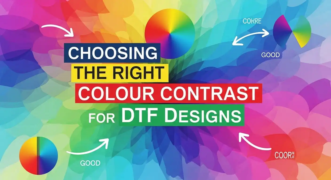
Colour contrast means the difference between light and dark colours in your design. In DTF printing, strong contrast helps your design stand out on fabric. Low contrast makes it look flat or hard to see.
For example:
- White text on black fabric = high contrast
- Grey text on black fabric = low contrast
This simple difference affects DTF print visibility more than most people realise.
Why Contrast Affects Print Quality
Let me explain this in a simple way. When you print on fabric, the material colour interacts with your design. If the contrast is weak, the fabric absorbs the design visually. That is why print readability and contrast are key for custom apparel.
Here is what good contrast does:
- Makes designs easy to read from a distance
- Improves sharpness and detail
- Creates a clean, professional finish
- Boosts customer satisfaction
On the other hand, poor contrast leads to faded-looking prints, even if the ink quality is high.
My Experience with Colour Mistakes in DTF Prints
I remember a client who ordered bulk prints for a brand launch. The design used dark blue text on a black hoodie. On screen, it looked fine. But once printed, the text almost disappeared. We had to redo the entire order. Since then, I always guide clients on choosing colours for DTF printing before production. Trust me, getting this step right saves time, money, and stress.
How to Choose the Right Colour Contrast for DTF Designs
Now let us get into practical steps you can follow.
1. Start with the Garment Colour
Always think about the fabric first.
Ask yourself:
What colour will the design go on?
This step is key in colour selection for garment printing.
- Dark garments → Use light or bright colours
- Light garments → Use darker tones
This creates strong apparel print colour contrast.
2. Use High Contrast Colour Pairs
Some colour combinations naturally work better. Here are a few effective colour combinations I often recommend:
- Black and white
- Yellow and black
- Red and white
- Navy and gold
These pairs give high contrast DTF prints that stand out clearly.
3. Avoid Similar Shades
This is a common mistake. Using colours that are too close in shade reduces visibility.
Examples to avoid:
- Dark green on black
- Light grey on white
This weakens DTF graphic design colours and reduces impact.
4. Focus on Readability
If your design includes text, this becomes even more important. Your text must be easy to read from a distance. To improve print readability and contrast:
- Use bold fonts
- Avoid thin lines
- Keep spacing clear
This helps your design stay sharp after printing.
5. Balance Colours in the Design
Too many bright colours can look messy. Too many dark tones can look dull. You need proper colour balance in apparel design. Here is a simple rule I follow:
- One main colour
- One contrast colour
- One support colour
This creates clean and strong designs.

Understanding Colour Impact on Print Design
Colours do more than just look good. They send a message. This is where colour impact on print design matters.
For example:
- Red feels bold and energetic
- Blue feels calm and trusted
- Black feels strong and premium
When you combine this with good contrast, your design becomes more powerful.
Best Colour Combinations for Different Garments
Let me break this down based on what I see daily.
For Black T-Shirts
- White, yellow, or neon colours work best
- Avoid dark tones
This improves vibrant DTF colour output.
For White T-Shirts
- Black, navy, or red work well
- Avoid very light shades
This keeps your custom t-shirt colour matching clean and sharp.
For Coloured Garments
This depends on the base colour.
For example:
- Blue shirt → Use white or yellow
- Red shirt → Use black or white
Always aim for strong apparel colour harmony.
Testing Your Colour Contrast Before Printing
Before final printing, always test your design. Here is what I recommend:
- View your design on a similar background colour
- Zoom out to check readability
- Print a small sample if possible
At Wisedtfprints.com, I often suggest test prints to clients. It helps avoid costly mistakes.
Real Example from My Work
A clothing brand wanted a bold streetwear design. We used black fabric with neon green text. The contrast was strong and eye-catching. The result? The prints sold out in days. That is the power of good DTF design colour combinations.
Common Mistakes to Avoid
Let me save you from some common errors I see:
- Ignoring garment colour
- Using too many colours
- Choosing trendy colours without testing
- Forgetting readability
- Relying only on screen previews
Fixing these improves your DTF print visibility instantly.
Tools I Recommend for Colour Selection
You do not need fancy tools, but these help:
- Adobe Illustrator
- Photoshop
- Online contrast checkers
These tools help you test colour contrast in DTF designs before printing.
Why Work with a Professional DTF Printing Service
Even if you design your artwork yourself, print quality still plays a big role. At Wisedtfprints.com, I guide clients on choosing the right colours before we print, so the final result looks sharp on fabric.
If you want consistent and reliable results, you can explore our full range on the
Wisedtfprints.com Shop where we offer ready-to-print and custom options.
- Many customers start with our high-quality A4 DTF transfer sheets for smaller designs, as they are perfect for testing colour contrast and layout before scaling up.
- If you need more flexibility, you can create your own custom gang sheets to fit multiple designs in one print, which works well for brands and bulk orders.
- For larger production needs, our wholesale DTF transfer options help you maintain consistent colour output across multiple prints while saving cost.
You can also visit Wisedtfprints.com to explore all products, get ideas, and understand how we handle colour accuracy in real print jobs.
Final Thoughts: Keep It Simple and Clear
Choosing the right colour contrast is not complicated. You just need to follow a few key rules:
- Think about the garment first
- Use strong contrast colours
- Keep designs clean
- Test before printing
From my experience, simple designs with strong contrast always perform better. If you get this right, your prints will look sharp, professional, and easy to notice. And that is exactly what every customer wants.
Read more: What Customers Notice First in a Printed T-Shirt
Frequently Asked Questions
What is the best colour contrast for DTF designs?
The best colour contrast depends on the garment colour. Light designs work well on dark fabrics, while dark designs suit light fabrics. High contrast DTF prints always give better visibility and sharper results. I always suggest testing your colours before final printing to avoid dull output.
How do I improve print readability in DTF printing?
To improve print readability and contrast, use bold fonts, clear spacing, and strong colour differences. Avoid similar shades, as they reduce visibility. Also, keep your design simple so the text and graphics stay easy to read from a distance.
Why does my DTF print look dull on fabric?
This usually happens due to poor colour contrast in DTF designs. If your design colours are too close to the garment colour, the print will look faded. To fix this, choose effective colour combinations and focus on proper colour balance in apparel design before printing.